Chart Types in Excel – Choosing best chart for Data Analysis session will discuss about different charts available in Excel like Bar Charts, Column Chart, Pie chart, Line Chart and other chart Types. And we will see how to choose the right chart for data analysis and reporting. There are lot of options adding in the Excel charting tools in every new version of Excel (Excel 2007,2010,2013). We will also see what are the new features in Excel Charting in new versions of Excel 2007,2010,2013 in this session.
- Chart Types in Excel
- Chart Types in Excel – Bar Charts
- Chart Types in Excel – Column Charts
- Chart Types in Excel – Pie Charts
- Chart Types in Excel – Line Charts
- Chart Types in Excel – XY Charts
- Chart Types in Excel – Area Charts
- Chart Types in Excel – Bubble Charts
- Chart Types in Excel – Other Chart Types
Chart Types in Excel
There are verity of charts available in excel to deal with different kinds of data. Pie, Column, Line, Bar, Area, and XY Scatter are most frequently used charts in Excel. And the other chars will be used based on the function. For example, Stock charts will be used most in the financial marketing functions and bubble charts are useful to study the competitive data analysis.
And in each chart type, we have different sub types, like Bar chart is having Clustered Bar, Stacked Bar and 100 % Stacked Bar Sub Chart types. And Column Charts is having Clustered Column, Stacked Column and 100 % Stacked Column, etc.
We will see each type of charts and when to use a particular chart and what type of data is suitable for a specific Chart Type.
Bar Charts in Excel
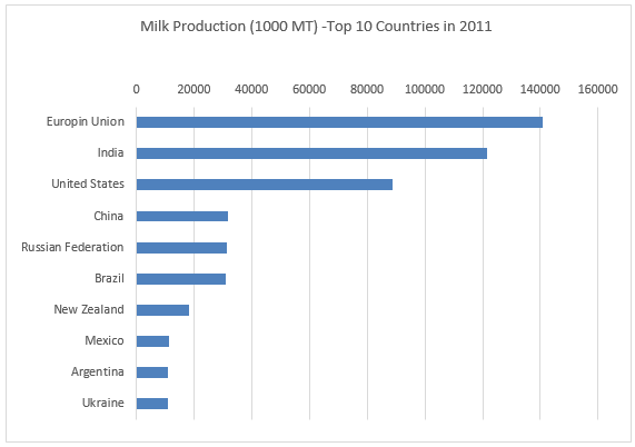
Bar Charts in Excel are suitable if the data is categorical or ranking data. For example, if you have the data for 10 categories and want to see how each category is performing. Or if you have ranking type of data and you can use Bar chart to quickly understand the figures.
Following are the example data and charts, you can clear and quickly interpret the data by looking at the data.
| SNO | Country | Production (1000 MT) |
|---|---|---|
| 1 | Europin Union | 140620 |
| 2 | India | 121500 |
| 3 | United States | 88768 |
| 4 | China | 31780 |
| 5 | Russian Federation | 31200 |
| 6 | Brazil | 30846 |
| 7 | New Zealand | 18049 |
| 8 | Mexico | 11228 |
| 9 | Argentina | 11070 |
| 10 | Ukraine | 10812 |
Table: Top 10 Countries By Milk Production in 2011.
Here is the bar chart for the ranking data for 10 categories.
Column Charts in Excel
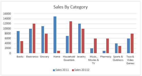
Column charts are suitable for comparative data analysis. If you have group of categories and want to compare the categories, you can choose Columns charts. You can compare the different metrics of over different time periods. For example, you can compare the 10 categories how they are performing in this year compares to the last year.
Following is the data for 10 Categories of a Store and its sales in 2011 and 2012. You can see the columns chart and easily understand and compare its sales in 2011 and 2012.
| Product Category | Sales 2011 | Sales 20112 |
|---|---|---|
| Books | 9000 | 5000 |
| Electronics | 10000 | 12000 |
| Grocery | 11000 | 8000 |
| Home | 15000 | 1000 |
| Household Essentials | 7000 | 13000 |
| Jewelry | 12000 | 10000 |
| Music, Movies & TV | 2000 | 6000 |
| Pharmacy | 1000 | 6000 |
| Sports & Outdoors | 4000 | 3000 |
| Toys & Video Games | 6000 | 8000 |
Pie Charts in Excel
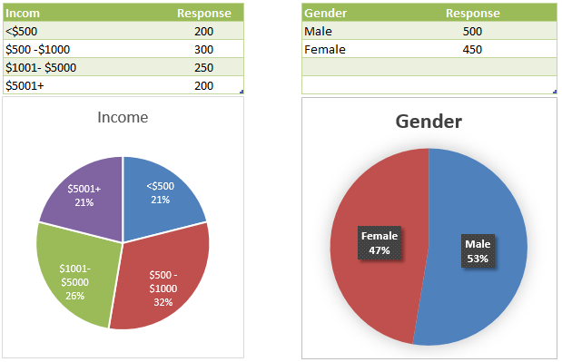
Pie charts in excel are good for showing proportional data. For example, you can show the percentages of few demographic categories in the pie chart to understand how each one in contributing.
The following examples will show you data for few demographic variables of market research survey of 950 responses, you can quickly understand the data by looking at the Pie charts:
| Incom | Response |
|---|---|
| <$500 | 200 |
| $500 -$1000 | 300 |
| $1001- $5000 | 250 |
| $5001+ | 200 |
| Gender | Response |
|---|---|
| Male | 500 |
| Female | 450 |
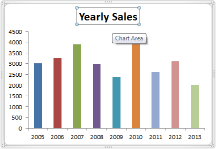
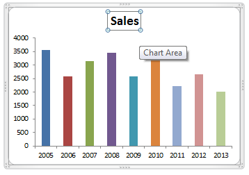
Line Charts in Excel
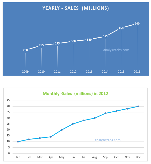
Line chart are useful for trend analysis. We can see the trend for different time frames or time periods using line charts in Excel. Also helpful to understand time series data to forecasting.
Following is the time series data for store, we can plot the Line chart and quickly understand the change of the metrics in different time periods. We can use Le charts for studying Yearly data, Quarterly, Periodic, Monthly, Weekly, Daily and Hourly change in the data.
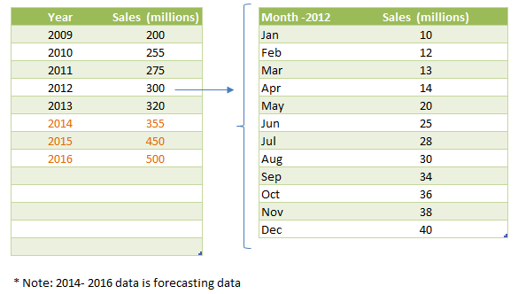
Here is the example time series data table:
| Year | Sales (millions) |
|---|---|
| 2009 | 200 |
| 2010 | 255 |
| 2011 | 275 |
| 2012 | 300 |
| 2013 | 320 |
| 2014 | 355 |
| 2015 | 450 |
| 2016 | 500 |
| Month -2012 | Sales (millions) |
|---|---|
| Jan | 10 |
| Feb | 12 |
| Mar | 13 |
| Apr | 14 |
| May | 20 |
| Jun | 25 |
| Jul | 28 |
| Aug | 30 |
| Sep | 34 |
| Oct | 36 |
| Nov | 38 |
| Dec | 40 |
Here are the Line Charts for the above time series data, we can quickly understand the change by looking at the line charts.
Scatter Chart or XY Charts in Excel
XY Charts in Excel are very helpful if you have paired or grouped set of data. You can plot scatter with huge data and see how the data is plotted and the pattern. Scatter chart is useful if you are analyzing the data.Scatter Charts are helpful for Statistical or Engineering applications to see the data patterns. Usually independent variables on x-axis and depending variables on y-axis.
We need two axes data values (co-ordinates) to plot the scatter chart. Here is an example data (heights and weights of a random sample), see how it is distributed in the XY Chart.
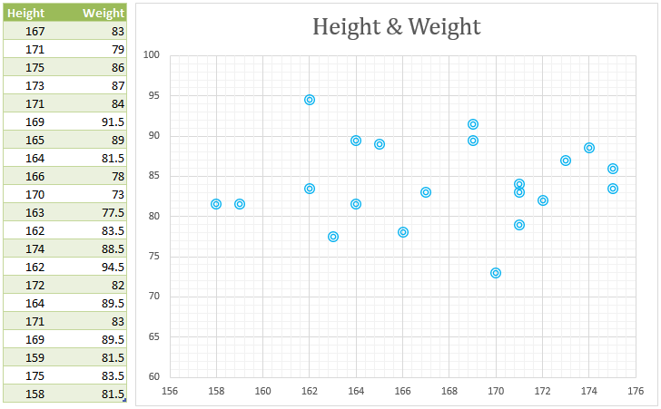
We can not find any pattern or relationship in this data. Following is another sample, you can see the positive relationship among the data points.
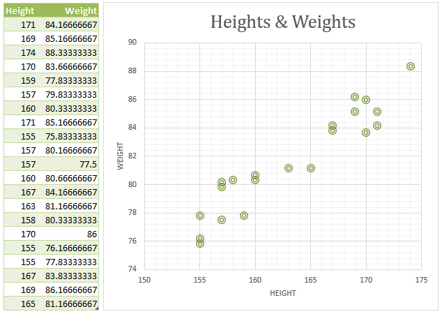
When you have two dimensional data, if both the dimensions are in the same direction (increase or decrease), we will find the positive relation ship. If they are opposite direction, we will see the negative relation ship. Some times we may not find any pattern or relationship in the data.
The main difference between XY Chart and Line Chart is, Line Chart is used for time series data to see the changes over the time period. And the XY Chart is for paired data to see the similarities among the grouped data.
Area Charts in Excel
Area charts is excel will help you to graphically find the size of each category. You can use the area charts if you have the data in columns and rows. Below is the examples area chart created for quarterly sales of a stores in different regions.
Area charts are more or less line charts, in area chart it will fill with the color of the area under the line.

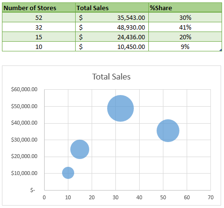
Bubble Charts in Excel
Bubble charts is excel will help you to visially quantify the share of category by comparing the size of each bubble in the chart. You can use bubble chart when you want to compare different items graphically.
Bubble charts are more or less looks like scatter charts, in bubble chart it will magnify the point based on its %share. Following is the example bubble chart created using quarterly sales of store.
Other Chart Types in Excel
The best way of representing any data is representing using graphs. One can easily understand the data if you show using charts. You can create rich visualized charts in Excel as shown above.There are many other charts available in excel like Stock Chart,Radar Chart, Doughnut Chart, Surface Chart. And you can also create Combination Charts in excel. You can create all these charts in Excel, Word and PowerPoint. And you have lot of options available in Excel 2013 than Excel 2003,2007 and 2010.
