- Free download
- Excel
- Google Sheets
- Word & PPT
- vs Network diagram
- What it is
- How to create one
- Example
- FAQ
Free Gantt chart templates for Microsoft Excel, Google Sheets, Word and PowerPoint. Every template generates colour-coded horizontal bars automatically as you enter task names, start dates, durations and completion percentages. Free download, no sign-up.
Gantt charts are the most widely used tool in project management for visualising schedules, tracking progress and communicating timelines. Whether you are running a software release, a construction project or a marketing campaign, a well-built Gantt chart turns a flat task list into a visual roadmap the whole team can read at a glance.
Free Gantt chart templates from Analysistabs
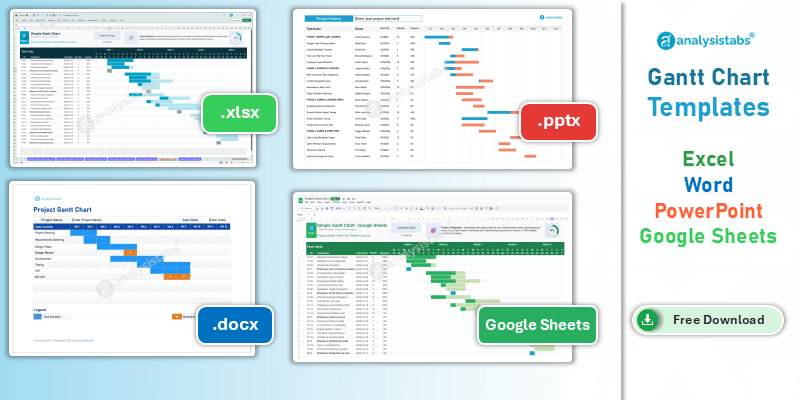
Gantt chart templates in Google Sheets, Word and PowerPoint, plus an Excel Gantt chart built into the project plan template. Each generates colour-coded stacked bars from your task names, start dates, durations and completion percentages — green for completed work, blue for work in progress, grey for pending. They support milestone markers, phase separators and scroll bars for large schedules. All work in Excel, Word and PowerPoint 2016 through Microsoft 365 on Windows and Mac. Free for personal and commercial use, no sign-up or email required. Automated task dependencies, critical path highlighting and resource heatmaps are available in the premium templates at Analysistabs.org.
Gantt chart template free download
Four formats. Bars redraw themselves whenever you change a date or a percentage.
- Colour-coded stacked bars — completed, in progress and pending shown separately on the same task.
- Milestone markers and phase separators — group related tasks and flag key deliverables.
- No manual drawing — the chart is generated from your data, not from shape objects you drag.
Free to download — no sign-up, no email required
Free for personal and commercial use. Works in Excel, Word and PowerPoint 2016, 2019, 2021, 2024 and Microsoft 365 on Windows and Mac, and in Google Sheets.
Gantt chart template Excel
The Excel Gantt chart tempate is built into our project plan template rather than shipped as a standalone file. That is deliberate — a Gantt chart on its own is just a picture, and it only stays accurate if the task table driving it lives in the same workbook.
The project plan template gives you the task table, the start and end dates, the progress column and the Gantt timeline together, with the bars regenerating automatically whenever anything changes.
Building your own in Excel?
Use a stacked bar chart rather than drawing rectangles. Set the first series — the offset from your earliest start date — to no fill, and the visible series become the task bars. See how to create a Gantt chart below for the full method.
Gantt chart template Google Sheets
The Google Sheets Gantt chart lets you build and share a project schedule online for free, with your whole team editing the same file. Click the link to make a copy directly in your Google Drive — no request access, no sign-up.
If you would rather build one from scratch, the step-by-step method is further down this page.
Gantt chart template Word and PowerPoint
Word and PowerPoint Gantt chart templates are for communication rather than calculation. They suit project charters, status packs, client proposals and steering committee decks — anywhere the schedule needs to sit inside a document rather than drive one.
Both are editable — the bars are shapes you position on a timeline grid, so they will not update themselves when dates change. Build the schedule in Excel or Sheets first, then present it in Word or PowerPoint.
Gantt chart vs network diagram
Both are essential project management tools and they answer different questions. A Gantt chart is a stacked bar chart showing the schedule in a timeline view — it focuses on tasks, time and progress. A network diagram is a flow chart showing the sequence of activities — it focuses on milestones, dependencies and logical order.
| Gantt chart | Network diagram |
|---|---|
| Pictorial representation of project schedules | Pictorial representation of project workflow |
| Focus on tasks and time management | Focus on milestones and sequential order |
| In-depth plan for understanding tasks | High-level plan for understanding workflow |
| Exact timelines defined (1 Jan to 25 Jul for Task A) | Estimated time frames (4 days, 2 weeks for Milestone A) |
| Effective for resource allocation | Not designed for resource allocation |
| Captures progress and completion percentage | Cannot capture progress percentages |
| Project status updated (New, In Progress, Completed) | Cannot update project status |
| Supports task descriptions and remarks | Cannot hold remarks or descriptions |
| Easy to modify and edit | Difficult to change once built |
| Built using stacked bar charts | Built using process flow diagrams |
Most project managers use both: a network diagram during planning to map the logical flow and find the critical path, then a Gantt chart during execution to track progress against the schedule.
What is the difference between a Gantt chart and a network diagram?
A Gantt chart answers when: it plots each task as a bar against a calendar, so you can read start dates, durations and progress directly off the timeline. A network diagram answers in what order: it plots tasks as nodes connected by dependency arrows, so you can trace which work must finish before other work can begin.
The practical consequence is that a network diagram will show you the critical path and a Gantt chart will not — the Gantt shows you the schedule that results from it. That is why the two are complements rather than alternatives.
Using a network diagram and a Gantt chart together
The normal sequence is to build the network diagram first, during planning. You identify every activity, map the dependencies, and let the longest dependent path through the diagram tell you the minimum project duration — that path is your critical path.
Only then do you build the Gantt chart, because the dependencies you just mapped determine which task can start on which date. Skipping the network diagram and going straight to a Gantt chart is how projects end up with bars that look neat but rest on a sequence nobody checked.
During execution the emphasis flips. The network diagram stays largely static unless scope changes, while the Gantt chart is what you update weekly and what feeds your project status report.
What is a Gantt chart?
A Gantt chart is a graphical representation of a project schedule where tasks are listed vertically and time runs horizontally. Each task appears as a horizontal bar whose length is its duration and whose position shows when it starts and ends. Stacked bars can separate completed work, work in progress and pending work, giving an instant visual summary of project health.
The concept was first developed by Karol Adamiecki, a Polish engineer, in the early 1900s. It was later named after Henry Gantt, an American project management pioneer who popularised and refined the format for industrial production scheduling. Gantt charts remain a staple across IT, construction, marketing and event planning.
What is a Gantt chart used for?
Gantt charts are the central scheduling tool in project management. They visually represent project schedules and project timelines, making complex plans readable. Project managers use them to display start dates, end dates and deadlines for every activity, and to show dependencies between them.
They give a clear view of task progress and completion percentages, help identify the critical path, support resource allocation by showing who is working on what, and act as a communication tool in stakeholder presentations and team meetings. More advanced charts add scroll bars for navigating large projects, milestone markers for key deliverables, and phase separators that group related tasks.
How to create a Gantt chart
There are two ways to build a Gantt chart in Excel or Google Sheets, and only one of them survives a schedule change.
| Method | How it works | Verdict |
|---|---|---|
| Shapes | Draw rectangles manually onto a timeline grid | Full visual control, but every date change means repositioning by hand. Avoid for live schedules |
| Stacked bar chart | Enter start dates, durations and progress, then insert a stacked bar chart that generates the timeline | Recommended. Bars update automatically. This is the method used in all the templates on this page |
The trick that makes the stacked bar method work is the invisible first series. You plot the offset from the project’s earliest start date as series one and set it to no fill — that pushes each visible bar to its correct position on the timeline. For a complete planning solution with the Gantt built in, use the free project plan template.
How to make a Gantt chart in Google Sheets
Step 1 — Prepare the data
-
Open a blank spreadsheetCreate columns for Task Name, Start Date, End Date and Progress.
-
Add a Start Number columnUse
=VALUE(StartDate - MIN(StartDateRange)). This is the offset that positions each bar on the timeline. -
Add Total Days
=EndDate - StartDate + 1 -
Add Days Completed
=TotalDays * Progress -
Add Days Pending
=TotalDays - DaysCompleted
Step 2 — Create the chart
-
Select and insertHighlight the Task Name and Start Number columns, then insert a chart.
-
Change the typeSet the chart type to Stacked Bar Chart.
-
Add the remaining seriesAdd Days Completed and Days Pending as additional series.
-
Hide the offsetSet the Start Number series to no fill or light grey. This is what creates the timeline offset.
-
Colour the workSet Days Completed to green and Days Pending to grey or red, then position the chart beside your data table.
Gantt chart example
This example shows the progress of a project by phase. Each stacked bar is a task: the green portion is completed work, blue is work in progress, grey is pending. Start date, due date and completion percentage are all readable without opening anything else.
The same format supports additional columns — the cost to complete each phase or milestone, resource assignments, and dependency arrows between related tasks.
Advantages and limitations of Gantt charts
Advantages
- Represent schedules and activities visually on a single graph
- Show tasks, sub-tasks, milestones and phases with clear date visibility
- View plans by day, week, month, quarter or year
- See team members and their assigned tasks side by side
- Group sub-tasks under main tasks
- Track project status and completion through colour-coded bars
- Identify work in progress and pending work at a glance
Limitations
- Take real effort to create and maintain manually
- Updating is time-consuming on large projects
- Not all tasks fit in a single view — scrolling is often needed
- Bars represent elapsed time, not hours of effort
- Realigning tasks between sections is fiddly
- Aggregate metrics are hard to calculate without automation
Modern Excel and Sheets templates with built-in formulas and conditional formatting — like the ones on this page — remove most of those manual pain points. The bars regenerate from your data, so updating a schedule means changing a date rather than redrawing a chart.
Download the free Gantt chart templates
All templates are free for personal and commercial projects, no sign-up required. For more, browse the complete project management templates library.
Gantt chart — Google Sheets
Make a copy directly in your Google Drive. Free to use and share with your team, with live collaborative editing.
Gantt chart — Word (.docx)
For charters, proposals and reports where the schedule sits inside a document. Word 2016 and later, Windows and Mac.
Simple Gantt chart — PowerPoint (.pptx)
For status packs and steering committee decks. PowerPoint 2016 and later, Windows and Mac.
Gantt chart — Excel
Built into the project plan template, so the task table and the timeline stay in the same workbook. Excel 2016 and later.
Need advanced Gantt charts?
The free templates cover most project scheduling needs. If you need automated task dependencies, critical path highlighting, resource heatmaps, multi-project portfolio views and executive-ready dashboards, the premium templates go further.
- Ultimate Excel PM Template ($69) — advanced Gantt chart with automated scheduling, resource tracking and a project dashboard.
- 120+ PM Templates Pack ($299) — complete toolkit with 50+ Excel, 50+ PowerPoint and 25+ Word templates.
120+ professional project management templates
Excel, PowerPoint and Word templates built from real projects. Trusted since 2012.
Where the Gantt chart sits in your workflow
Frequently asked questions
Is the Gantt chart template free to download?
Yes. Every template on this page is free for personal and commercial use, with no sign-up or email required.
What is a Gantt chart?
A visual project management tool that displays tasks as horizontal bars along a timeline. Each bar’s length is the task’s duration and its position shows when it starts and ends. Gantt charts help managers plan schedules, track progress and communicate timelines to stakeholders.
Who invented the Gantt chart?
The concept was first developed by Karol Adamiecki, a Polish engineer, in the early 1900s. It was later named after Henry Gantt, an American project management professional who popularised the format for industrial production scheduling.
How do I make a Gantt chart in Excel?
Use a stacked bar chart rather than drawing shapes. Plot the offset from your earliest start date as an invisible first series, then add completed and pending days as visible series. The bars then position themselves on the timeline and update whenever dates change.
Can I create a Gantt chart in Google Sheets for free?
Yes. Use the free Google Sheets template on this page — the link creates a copy in your own Google Drive that you can customise. You can also build one from scratch using a stacked bar chart; the steps are above.
Is there a Gantt chart template for Word and PowerPoint?
Yes, both are on this page. They are designed for presenting a schedule inside a document or deck rather than calculating one, so the bars are editable shapes rather than formula-driven. Build the schedule in Excel or Sheets first.
What is the difference between a Gantt chart and a network diagram?
A Gantt chart uses horizontal bars to show task schedules and progress over time — it focuses on when things happen. A network diagram uses a flow chart format to show dependencies between tasks — it focuses on what order things happen. Managers often use both together.
Should I use a network diagram and a Gantt chart together?
Yes, and in that order. Build the network diagram during planning to map dependencies and find the critical path, then build the Gantt chart from it to see the resulting schedule. The network diagram stays static; the Gantt chart is what you update each week.
What are the advantages of using a Gantt chart?
They make schedules easy to visualise, help teams see deadlines and time frames at a glance, support resource allocation, track completion percentages, and work well as communication tools in meetings and stakeholder presentations.
What are the disadvantages of a Gantt chart?
They can be time-consuming to create and update manually, may need scrolling on large projects, and represent elapsed time rather than effort hours. Automated Excel and Sheets templates with built-in formulas largely solve these issues.
Do these templates support task dependencies?
The free templates show the schedule but do not calculate dependencies automatically. For automated dependency logic and critical path highlighting, see the Ultimate Excel PM Template linked above.
Related project management templates
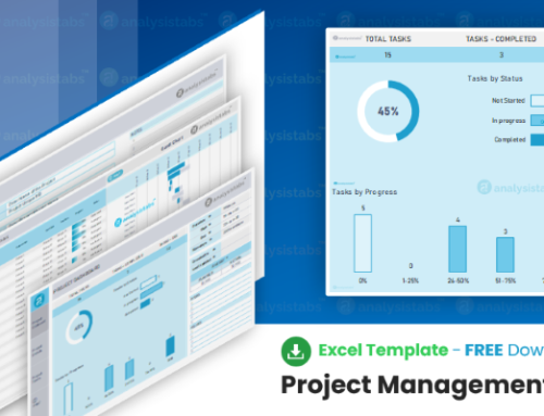
- Project plan template — the task table and Gantt chart together in one workbook.
- Project timeline template — a simpler milestone view without task-level bars.
- Multiple project tracker — Gantt views across a portfolio rather than one project.
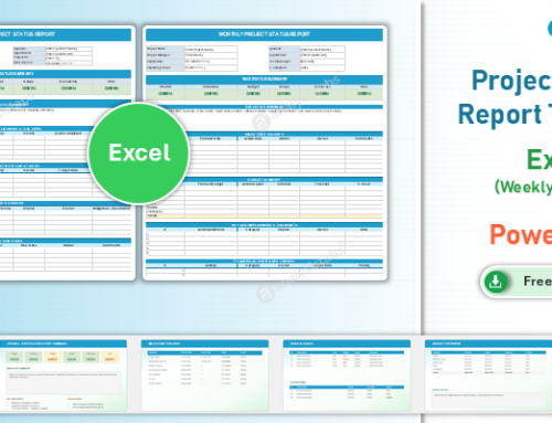
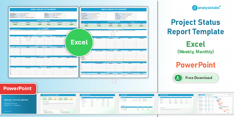
- Project status report — the written update your Gantt chart feeds.
- Resource planning template — who is assigned to the tasks on your chart.
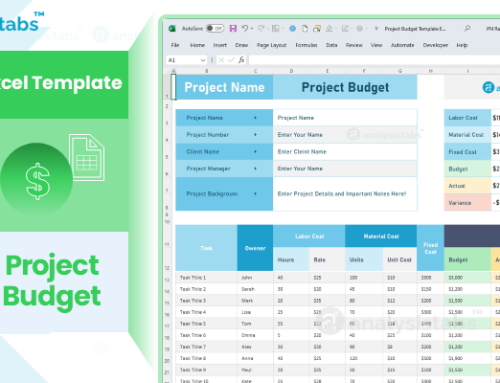
- Project cost estimator — cost per phase and milestone.