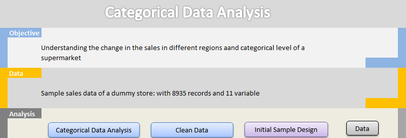
Categorical or Comparative Data Analysis is helpful to study the categorical data to understand and compare the metrics between different categories. For example, we can study effect of particular drug in various countries in health care projects. If we consider retail data, we may study POS (Point of Sales) Data, how is the sales in various regions of the country, or how many units are selling from each store or from each department of the supermarket.
We can study the Banking data to see how the customers are using our products from different regions or schemes. In telecom domain we can track how the different plans are doing in the market.
You can download the Example File and practically learn categorical comparative data analysis.
Download Now: ANALYSISTABS- Categorical Analysis -Sales-Data
Categorical Data Analysis: Practical Example:
We will take an example categorical data of retail domain. And we will apply categorical analysis using Excel and VBA to study the data and draw the insights from the data.
Categorical Analysis: Data Analysis Approach:
As discussed in the Trend Analysis, we have to follow certain steps while analyzing any data. Following are the steps to follow for analyzing the data using Excel and VBA.
- Understanding requirement
- Understanding the Data
- Design and Planning
- Cleaning the Data
- Identifying the variables and creating new variables
- Plotting the Charts and Tables to understand the Data
- Providing Interactivity using VBA
- Providing Help or Guidelines to users
- Understanding Summarized Data
- Writing Overall Summary and Insights
Now we will see these steps one by one:
Understanding requirement:
Generally your clients will provide the categorical data and give the requirement based on their business needs to solve certain business problems.
Let’s assume that I am your client. And I am providing the following categorical data and asked you to tell me, how is my sales in different Regions, Sates, Categories and Sub categories?
You can see the Input Data in Data tab of the attached workbook, here are the record counts and variables in the data. This is the same which we have discussed in trend analysis.
Total 8962 records with the following information
| Row ID |
| Order Date |
| City |
| State |
| Region |
| Product Category |
| Product Sub-Category |
| Order ID |
| Order Priority |
| Sales |
| Unit Price |
So, now you understand what is my requirement is (how is my sales in different Region levels and Category levels).
Let’s move to the next step, where you can understand the data or information provided by the client.
Understanding the Data
Now your goal is to understand the data so that you can start analyzing the data.
Generally you can prepare a table with the given variables and write what we understand from the given data and variables.
| Row ID | Record number |
| Order Date | date when customer placed an order |
| City | City where customer bought the products |
| State | State where customer bought the products |
| Region | Region where city fall in |
| Product Category | Category of the category product belongs to |
| Product Sub-Category | Sub category of the product |
| Order ID | Order Id, generally automated code by a computer for one order by customer |
| Order Priority | Priority of the order based on the delivery time |
| Sales | Total sales of the order |
| Unit Price | Number of units placed in the order |
Once you are done with the initial understanding of the data, you can check with your client whether your understanding is correct. You can made any changes to the above table which have prepared based on your final understanding of the data.
Design and Planning
Once you are clear with the requirement and data, it is the time to prepare a sample design of your output which you want to deliver to your client.
The requirement is understanding the sales and Units in different time periods. You can provide simple graphs and tables for each category level which you are going to provide to the client. And then write a summary of your findings, understandings, insights and suggestions. I have provided the sample design for categorical data, in the attached file.
Cleaning the Data
There are some missing values in the Sales and Units (Example Row ID 143 to 149). Our goal is to study the sales and units of the store, so we can’t use these records (Row ID 143 to 149) for categorical data analysis. There are many methods for missing data treatment, we will see it later. Now, you can remove those records in this case.
There are 1862 records in our data, now you will have only 1844 records after removing the missing data cases.
Identifying the variables and create new variables
We have total of 11 variables, we use only eight variables are enough to perform categorical data analysis. We have to understand the data on different categories like Region, State, Category and Sub category. We select only these 8 variables to understand the store sales performance in these category levels.
Plotting the Tables and Charts to understand the Data
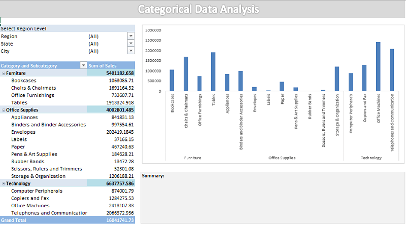
Now, we need to create initial charts and tables to understand the data. We can add pivot tables to summarize the data
I placed the region levels i.e; Region, State and City in the Pivot report filter field, and Category and sub category in the Pivot Row fields and the Sales in the Pivot Values field
Now you can select any combination from these selection to understand the sales data at different levels of Region and Category levels of the store.
Providing Interactivity using VBA
In this example I have not included nay VBA code, if you want to study the data with more variables like Time frame. You can provide a drop-down list as shown in the Trend Analysis. So that user can filter the data with different time frames too.
Providing Help or Guidelines to users
Help will provide the guideline to the user of this dashboard to understand how to use this tool. You can provide it in a separate worksheet sheet.
Understanding Summarized Data
Check the data in different States and Regions with different combinations and understand the sales on different scenarios.
Writing Overall Summary and Insights
Write your findings in the summary worksheet or in the same worksheet or Home tab.
Your final Categorical Data Analysis Tab should look like this:
Hope you enjoyed learning Categorical Data Analysis using Excel. You can share your thoughts on this topic or any feedback below.


