
Trend or Longitudinal Data Analysis is helpful to study the historical data to understand the changes in the data over particular time frame. Time frame can be several weeks, months, Periods, Quarters and Years, it’s depending on the requirement and domain or may be availability of the data.
For example, we can study patient situation over different years in health care projects. If we consider retail data, we may study the POS (Point of Sales) Data, how is the sales of different time periods?
We can study the Banking data to see how the customers are engaged with different products of the banking services. In telecom domain we can see how the customers are switching from one plan to different plans. So, we can apply trend analysis on various kind of data to understand how the data is changing in different over the time.
You can download the Example File and practically learn trend analysis.
Download Now: ANALYSISTABS-Trend Analysis -Sales-Data
Trend Analysis – Practical Example:
We will take an example historical data of retail domain. And we will apply trend analysis using Excel and VBA to study the data and draw the insights from the data.
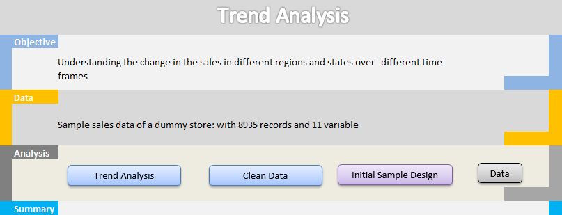
Trend Analysis: Data Analysis Approach:
We have to follow certain steps while analyzing any data. Following are the steps to follow for analyzing the data using Excel and VBA.
- Understanding requirement
- Understanding the Data
- Design and Planning
- Cleaning the Data
- Identifying the variables and creating new variables
- Plotting the Charts and Tables to understand the Data
- Providing Interactivity using VBA
- Providing Help or Guidelines to users
- Understanding Summarized Data
- Writing Overall Summary and Insights
Now we will see these steps one by one.
Understanding requirement:
Generally your clients will give the requirement based on their business needs to solve certain business problems.
Let’s assume that I am your client. And I am providing the following data and asked you to tell me, how is my sales in different Regions and Sates over different time periods?
You can see the Input Data in Data tab of the attached workbook, here are the record counts and variables in the data.
Total 8962 records with the following information
| Row ID |
| Order Date |
| City |
| State |
| Region |
| Product Category |
| Product Sub-Category |
| Order ID |
| Order Priority |
| Sales |
| Unit Price |
So, now you understand what is my requirement is (how is my sales in different Regions and Sates over different time periods).
Let’s move to the next step, where you can understand the data or information provided by the client.
Understanding the Data
Now your goal is to understand the data so that you can start analyzing the data.
Generally you can prepare a table with the given variables and write what we understand from that.
| Row ID | Record number |
| Order Date | date when customer placed an order |
| City | City where customer bought the products |
| State | State where customer bought the products |
| Region | Region where city fall in |
| Product Category | Category of the category product belongs to |
| Product Sub-Category | Sub category of the product |
| Order ID | Order Id, generally automated code by a computer for one order by customer |
| Order Priority | Priority of the order based on the delivery time |
| Sales | Total sales of the order |
| Unit Price | Number of units placed in the order |
Once you are done with the initial understanding of the data, you can check with your client whether your understanding is correct. You can made any changes to the above table which have prepared based on your final understanding of the data.
Design and Planning
Once you are clear with the requirement and data, it is the time to prepare a sample design of your output which you want to deliver to your client.
The requirement is understanding the sales and Units in different time periods. You can provide simple graphs and tables for each region type on various time frames. And then write a summary of your findings, understandings, insights and suggestions.
You can present your ideas to the client by preparing the design in Excel or PowerPoint presentation based on the requirement.
I have provided the sample design, in the attached file. It is hidden, you can unhide the tab by right click on any worksheet tab of the workbook.
Cleaning the Data
Data cleansing is one of the common tasks in data analysis. Before analyzing the data we must clean and validate the data. So that we will get the accurate results or estimates as output to accurately understand the data.
What we validate or clean: There may me any missing data or invalid data. We can identify these using simple frequency table for each variable. In Excel you can plot a pivot table and see if there are any blanks in the pivot table data.
If you check our Data tab, there some missing values in the Sales and Units (Example Row ID 143 to 149). Our goal is to study the sales and units of the store, so we can’t use these records (Row ID 143 to 149) for analysis. There are many methods for missing data treatment, we will see it later. Now, you can remove those records in this case.
There are 1862 records in our data, now you will have only 1842 records after removing the missing data cases(143,144,145,146,147,148,149,6086,6087,6088,6089,6090,6091,6092,6093,6094,6095,6096).
Identifying the variables and create new variables
We have total of 11 variables, we do not required all those variable to our analysis. We can drop Order ID, Order Priority variable from the data. Of course we do not required few other variables like City to understand the sales trend, we will not remove those variables as we will them for further analysis (Categorical data analysis, we will see this later)
And our goal is understanding the sales on different time frames. We have Order Date to understand the sales to achieve it. Using the Order Date we can create four more variables, such as Year, Quarter, Month and Week day. So that we can understand the data using these new variables.
Excel function Year, Month, Week day will help to create Year, Month and Week day variables. And the following formula helps to create Quarter variable.
=IF (L2<4,1,IF(L2<7,2,IF(L2<10,3,4)))
Where L2 is month of the date.
Finally, we have (9+4=) 13 variables and 1842 records to perform our trend analysis.
Plotting the Tables and Charts to understand the Data
As per our sample design, we need to plot tables and charts to understand the Sales on different time frames.
So I want provide a pivot table and chart to achieve this, so that I can change the different variable to see the respective data.
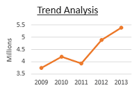
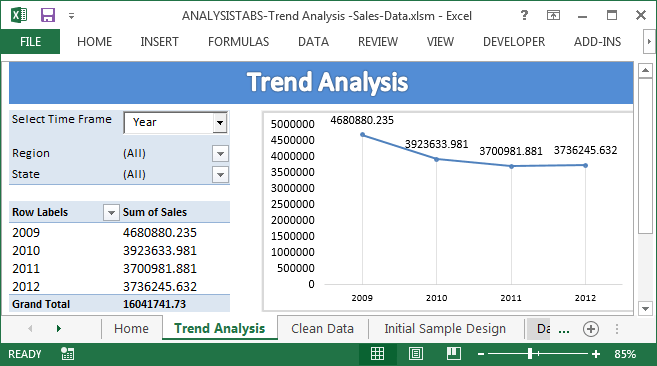
First, we are going to create pivot table on Sales by Year. Here Sales will be in the Pivot Values Fields list (select sum as aggregate) and the Year will be in the Pivot Row Field list.
Once you are done with the pivot table, it should look like a table with Years on left and respective Sales in the right.
Now you can add a pivot chart to the same table. Select pivot table and inset pivot chart from the inset tab of the ribbon.
You can add Region and States in Pivot report filed list
Using above table and Chart it is easy to understand the sales data, how sales is changing over different years. Like this we can plot 3 more pivot tables and Charts for Quarter, Month and Week day to understand the sales data on these variables.
Providing Interactivity using VBA
Instead of providing different tables for each variable, we can manage with one pivot table and chart by taking the advantage of VBA.
We will write the VBA macro to change the Pivot Row field variables, so that using one single list, we can able to analyze sales on different variables like Year, Quarter, Month and Week day.
Follow the below steps to make interactive pivot table and pivot chart.
- Add an ActiveX list box from developer tab and name it as ‘lstTimeFrame’.
- Alt+F11 to open the VBE and double click on the ThisWorkbook and Copy the following code into the module
Private Sub Workbook_Open()

With Sheets("Trend Analysis").cmbTimeFrame
    .Clear
    .AddItem "Year"
    .AddItem "Quarter"
    .AddItem "Month"
    .AddItem "Weekday"
End With

End Sub
Press F5, it should populate your list box in Trend Analysis Tab.
Now go to design mode and double click on list box in the Trend Analysis Tab, you can see the below code in the module:
Private Sub cmbTimeFrame_Click()

End Sub
Copy the below code and replace instead of the above code:
Private Sub cmbTimeFrame_Click()

    Set PTable = ActiveSheet.PivotTables("PivotTable1")

    For Each fld In PTable.RowFields
        fld.Orientation = xlHidden
    Next

    With PTable.PivotFields(cmbTimeFrame.Value)
        .Orientation = xlRowField
        .Position = 1
    End With

End Sub
Now you can save the workbook as macro enabled file and reopen it to see the interactivity.
Providing Help or Guidelines to users
You can provide some help to the users of this tool, so that can understand how to use this tool to understand the sales trend.
Understanding Summarized Data
Check the data in different States and Regions over different time frames and understand the change in on different combinations.
Writing Overall Summary and Insights
It is better to provide a summary of what you understand from the data using trend analysis. You can write summary based on your initial observation in the Home tab. You can format the table and chart as per your requirement.
Your final Trend Analysis Tab should look like this:
You can download the file and understand how analysis help to understand the sales trend. Now you can use this approach to understand any historical or longitudinal data based different time frames.
Hope you enjoyed learning Trend Analysis. You can read Categorical Analysis to get more insights from the data. You can share your thoughts on this topic or any feedback below.