


Many of our readers asking me to post tutorials to understand Excel Chart Elements and Chart wizard. This is the topic for those who wants to understand and getting started with excel charts. In this topic, We will see what are the different objects or elements related to charts, and how to access chart elements and change the chart properties. And then we will see what is the chart wizard in Excel what is the use of Chart Wizard in Excel.
- Charts in Excel
- Basic Elements of Excel Charts
- Basic Elements of Excel Charts – Chart Area
- Basic Elements of Excel Charts – Plot Area
- Basic Elements of Excel Charts – Chart Titles
- Basic Elements of Excel Charts – Chart Axis Titles
- Basic Elements of Excel Charts – Legends
- Basic Elements of Excel Charts – X-Axis
- Basic Elements of Excel Charts – Y-Axis
- Basic Elements of Excel Charts – Data Labels
- Basic Elements of Excel Charts – Gridlines
- Chart Wizard in Excel
There are many chart elements in excel to customize the charts to suit our data. Start learning Excel Chart Elements and Chart wizard to begin with Excel Charting.
Charts in Excel:
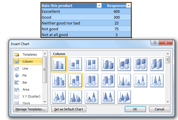
Charts help us to quickly understanding the data by plotting the data in graphs. We can present the data to visually represent with charts in Excel. Here is an example chart for customer ratings for an item. We can see the chart and quickly understand how the customers are liking a product.
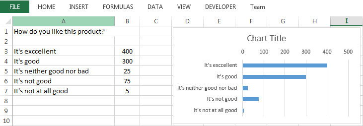
On left, we can see the data with customer satisfied. These are the responses for the questions “How do you like this product?”, There are 805 respondents answer this question and shared their opinion about an item on a 5 point rating scale.
On right, Chart is created with the customers responses. By looking the charts, we can quickly say that the customer satisfaction level is very good with the item. This is an example of Bar chart in Excel, which is suitable for quickly understanding the ranking data.
There are various types of the charts available in Excel to represent the data. We discuss this in Chart Types Tutorial.
Basic Elements of Excel Charts
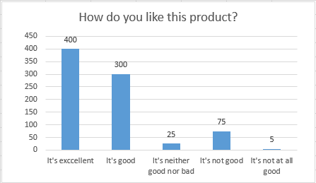
The above chart is the basic charts in Excel, We can customize the charts by dealing with different Chart Element Objects and its properties. In this session we will focus on different elements of charts objects:
Here is an examples Column Chart for the same data shown above:
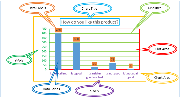
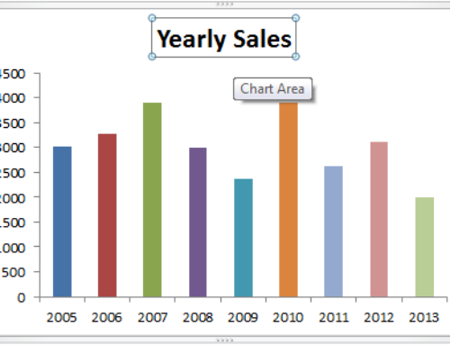
And here I have marked the basic chart elements in Excel each element with different clor for understanding purpose. Most of the times we generally deal with Chart Area, Plot Area, Chart Title, Legends, X-Axis, Y-Axis, Data Labels Data Series and Gridlines . Here is the pictorial representation of Chart Elements or Chart Objects in Excel:
Now will see each element of Excel Chart in detail:
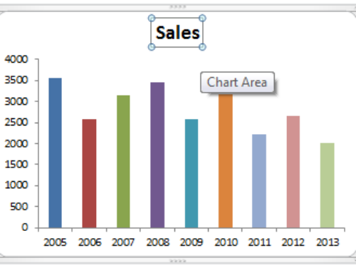
Basic Elements of Excel Charts – Chart Area
Chart area in Excel Charts is the largest element (portion) of the Chart. We can format the Chart Area and change its border and background colors to make the charts looks more cleaner. Legends, Chart Titles and Plot Areas are the three major child elements of Chart Area.
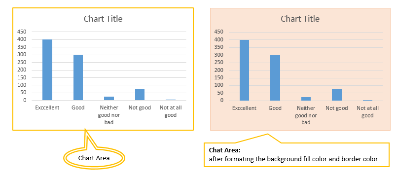
Generally we do not change the background color of the charts to make it look more professional. Charts looks more cleaner with white or default background color. However, we can change the background color to suite with the other parts of the excel sheets to make it consistent.
Basic Elements of Excel Charts – Plot Area
Plot Area is the second largest element (portion) in Excel Charts. It covers the actual chart data area. We can access the Plot Area and Format it to suit or needs.
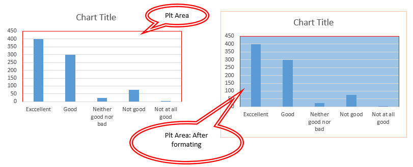
It is same as Chart Area, if your project need different background color then we change it. Otherwise default background color (white) looks more cleaner.
Basic Elements of Excel Charts – Chart Titles
We can provide the title in Excel Chart. There are three different chart titles we can provide in Excel charts, One Chart Title and Two Axis Titles.
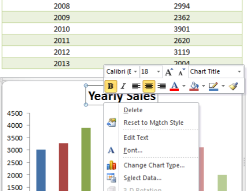
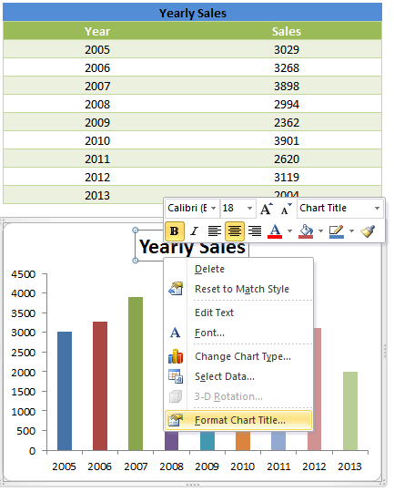
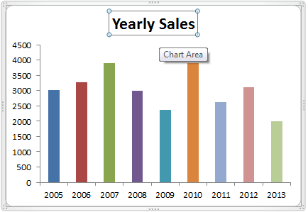
Chart Title
Chart title is the main title of the chart, which is generally represents your chart and tell users what is this chart all about. Here is the Example Chart Tile we provided for the above Data.
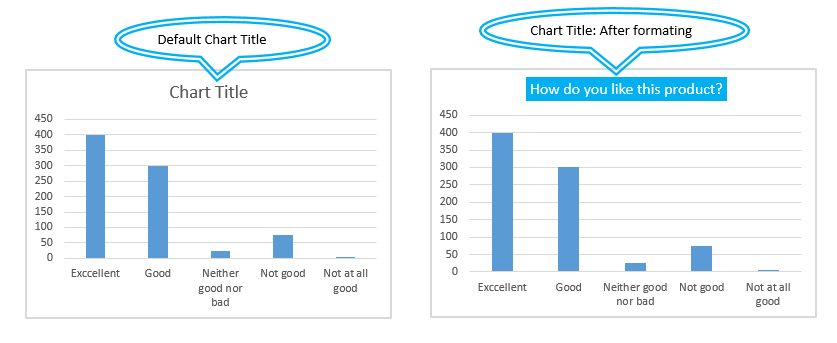
It is important to tell your user, What is this chart all about. So we generally provide the Chart titles, except some specific cases.
Basic Elements of Excel Charts – Chart Axis Titles
There are two Axis Titles which we can provide in Excel Charts. X-Axis title, which is for horizontal axis. and the second one is Y-Axis Titles, which is for Vertical Axis.
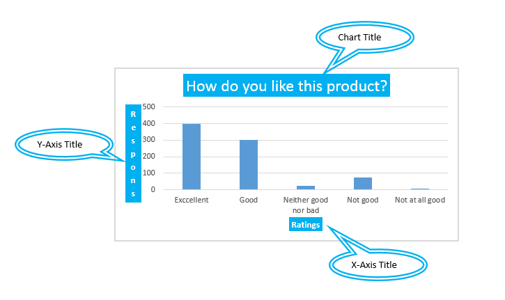
We should provide the chart Axes titles to make your users to understand the data and chart in better way. Most of the time, axis titles are shorter. However, some time we may need to provide longer titles to make it more clear.
Most of the times x-axis will have all your categories, so your x-axis title would be your category column name. And y-axis is your metric field, here you can mention the units in thousands, millions,etc.
Basic Elements of Excel Charts – Legends
When we have the data for more than one item, we need to distinguish between the data. We can take the advantage of the Chart Legend to show the difference between two categories.
Here is the example data and Chart with legends to understand the use of Chart Legends. Here we are showing the Overall satisfaction with Blue series and Quality in Orange Color. And Legends will help you to understand by providing the color definitions for each category of the data.
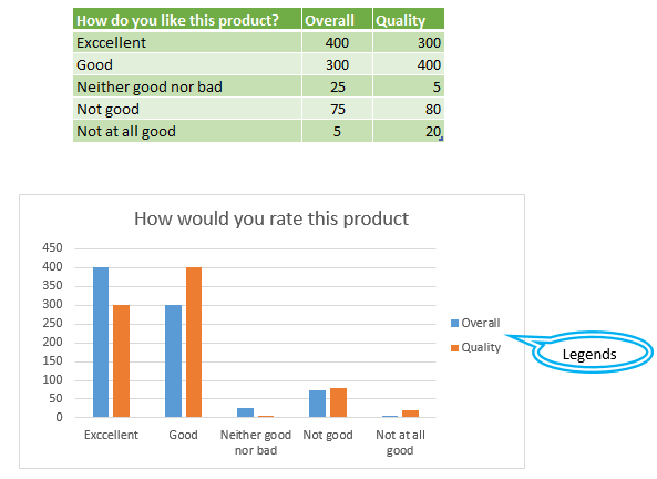
You can align the legends at any side of the Chart Area. If you have more number of category series, we generally place at right side of the chart plot area. Other wise we can place at top or bottom of the plot area to save the place.
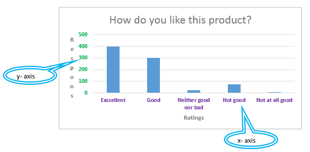
Basic Elements of Excel Charts – X-Axis
X-Axis in Excel Charts is the Horizontal Axis element in the chart. We generally plot the categories of our data on X-Axis. We can format x-axis as per our requirement. Make sure when we have longer category labels, we need to format chart axis to correctly fit the axis label into the chart
Basic Elements of Excel Charts – Y-Axis
Y-Axis in Excel Charts is the Vertical Axis element in the chart. It generally show the data range on Y-Axis. We can format x-axis as per our requirement. If we have two different types of data metrics, we can provide two y-axes, one is primary axis and the another one is secondary axis. Some times we may have large numbers in our data, in this case our chart looks more confusing. We can change the units to thosand, millions, etc. to make the charts more cleaner.
Basic Elements of Excel Charts – Data Labels
Data labels includes data values, category name, series name, legend keys and values form cells. We can choose all of these elements or any few as per our requirement.
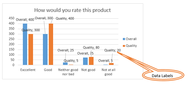
Data labels looks good when we have one or two data series. If you have more number of series, your chart looks confusing with overlapping data labels. Avoid data labels when you have more number of data series or consider changing the units into thousand, millions,etc.
Basic Elements of Excel Charts – Gridlines
Gridlines helps to quickly understand the values or percentage of the data without looking the exact values. we can understand the approximate value of the data by looking at the data series with gridlines.
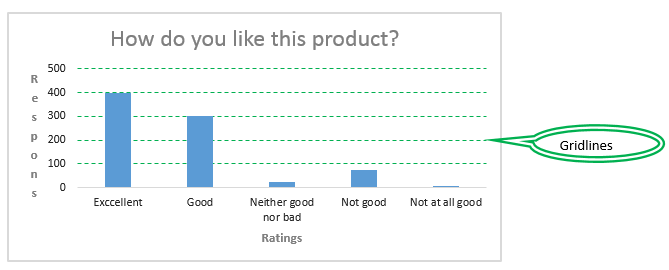
Again gridlines are sometime useful.You can delete the gridlines if they are not necessary to make your chart more cleaner.
Chart Wizard in Excel:
Excel Chart Wizard helps us to quickly to create charts in Excel. It is very easy to use and you can create rich visualized graphs in excel. You have to select the data first before launching the chart wizard.
Here is the Excel 2010 Chart wizard, it has number of charts to choose based on our data.
Here is the Excel 2013 Chart wizard, it more intelligent than Excel 2010. There are many charts provided to choose as per our data, and its provide recommended charts based on selected data.
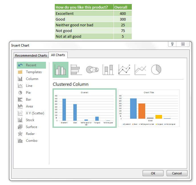
Ther are many options in Chart Wizard, we can create template with our frequently used charts. And also it will show you recently used charts to make our job more quicker. We can see the preview of the chart for the selected data in Excel 2013.
Related Posts
3 Comments
Leave A Comment
You must be logged in to post a comment.
pls explain steps for all in details
I seek your kind cooperation to make a graph in excel with the undermentioned details. The x-axis should represent “Comprehensive”, “Individual”, “Group” and the YAxis should represent “Earned”, “Incurred” and “Expenses”
Comprehensive Individual Group
Earned 50000 40000 30000
Incurred 25000 15000 5000
Expenses 10000 8000 12000
Your kind cooperation in this regard is sincerely solicited
Kindest regards
S. Chowdhury
This is for wizards?